Hi guys,
Just wanted to share my thoughts on the new Profit.ly (Nothing personal) from a Web Developer perspective:
In general, there is one thing I like, "responsive design".
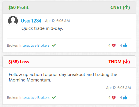
However, if I would have designed Profitly I would not have used so many background colors here and there, especially green color for the main actions. IMO Green color fits for showing the profit of a user, the positive winning %, etc., but you can't pretend that you will use the same background on buttons, profits, headers, everywhere and later ask the user do you see below which bar indicates the profit of the user? Not sure he will even see it because it's just everything is green. Colors have a meaning and you can't just use them for everything. Now I understand that you guys wanted to port the design of the previous Profitly. but man, it's just too hard to read and affects your eyes constantly.
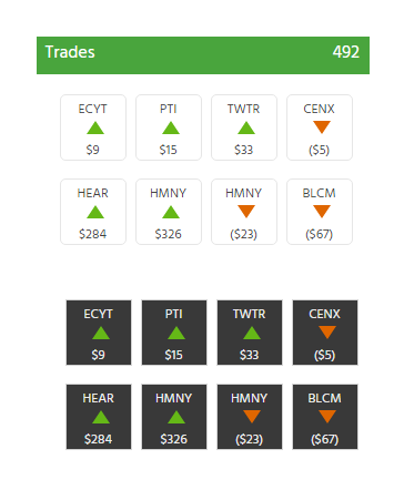
I will put an example, the trades page:
I wouldn't have used so many green/red colors unless necessary. More or less this is what I could have come up with, simply because is easier to read and requires less scrolling. Where the headers should have a simple light color in the background. To indicate that is a short use a down arrow and to indicate is a long we can use an up arrow, whether it should be in parentheses I don't know.
Also, why do we need to use the same username and the picture over and over and over again, so I would probably remove it as well, and only show it at the top somewhere. Now this is probably a concept from Profitly so I wouldn't change that. Now the colors :O what should I say? It is too strong for your eyes I can't even read the profits of the user anymore. You guys can't put a background to everything. Now I have to write a chrome extension to inject a CSS file to modify profit.ly colors as I want cause I can't lose my eyes on this and obviously you guys probably won't take many advice :)
Also, I would rather chose to see the trades in a white background that in a dark one.
Also, somebody tell me please:
1- Where is the link to the Dashboard? Why is it not added to the main links in the header of the page?
2- Why if the user is already logged in he isn't redirected to his user page https://profit.ly/user/<xyz>
3- Also, I hate to have sooo many buttons at the header of the page: "+ Blog Post", "+ Watchlist", "+ Video", ... I would rather have just one floating "plus or post" button like here and have all those + actions under it.
But again, I guess Tim didn't want to spend a big budget in the developers to come up with more improvements for the website. Honestly I believe the new profit.ly is missing a bit of love from the creators, but that's just my opinion.
As a free member though, I suppose I can't complain. :\
hahaha, I can´t complain either though, at least not as a free member :)
preach it buddy! feel the same way here!
Such perspectives for web design and development are very impressive. I'm very grateful for any tools that can help me in my work and recently found a source that has become absolutely indispensable for me https://masterbundles.com/graphics/icons/ Master Bundles helped me choose the right icon sets and I can always count on tons of inspiration and unique ideas.
Join now or log in to leave a comment