I have no idea how to even read that chart lol.. mind walking me through it abit and telling me what you're seeing that i am not :)? might actually learn a little from this lol..
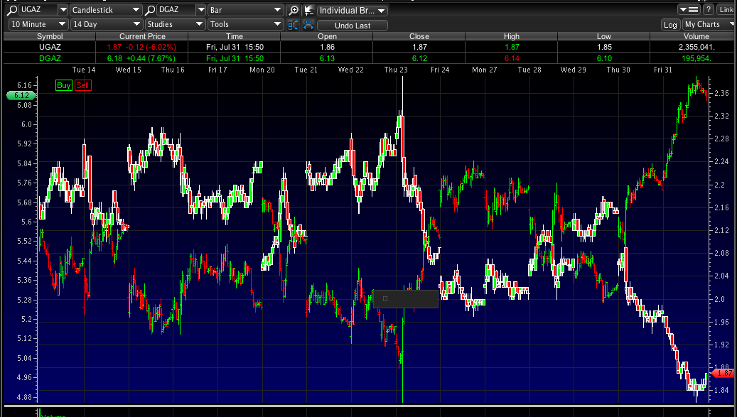
@Timnyman94 sure man. Its two stocks DGAZ is the darker looking bar chart and its price range is on the left side. The UGAZ movement is notated by the lighter green an red candlesticks. So, basically putting the two together on one space shows how they they mirror each other's movements. When DGAZ is up, UGAZ is down, and vice versa in the exact opposite pattern...
@Timnyman94 No prob. Its so weird, cuz they are so exact. The only issue is that since they are so dead on, you can't really use one to predict the other. If one was ahead of the other in their climbs and falls, that would be perfect!
I have no idea how to even read that chart lol.. mind walking me through it abit and telling me what you're seeing that i am not :)? might actually learn a little from this lol..
@Timnyman94 sure man. Its two stocks DGAZ is the darker looking bar chart and its price range is on the left side. The UGAZ movement is notated by the lighter green an red candlesticks. So, basically putting the two together on one space shows how they they mirror each other's movements. When DGAZ is up, UGAZ is down, and vice versa in the exact opposite pattern...
@LeftyLucas Okey.. so you can actually use this one "kinda" to predict when one will rise / the other will fall ? :) thanks for explaining aswell!
@Timnyman94 No prob. Its so weird, cuz they are so exact. The only issue is that since they are so dead on, you can't really use one to predict the other. If one was ahead of the other in their climbs and falls, that would be perfect!
Join now or log in to leave a comment